
Hello all,
I have owned a MD license from a while (starting with version 2 later upgraded to 5.5). I am not a power user - I only use the application for small parts of 3D projects as opposed to simulating full garments. For that purpose I tend to register to the current version for a month if I need any advanced features (like sewing/editing directly in the 3D viewport), then revert back to 5.5 for basic use.
In that context I have recently been using MD11 and I am genuinely surprised by the regression in terms of user experience. Of course the recent features are great, and I like how the top menus are more logically organized than before. However the UI for editing is objectively worse than older versions, and the performance when interacting with the application (not simulation, just using the menus and buttons) is also notably worse. Here is some feedback.
- - - - -
1 - Elements from the top bar that used to open instantly (Settings/Preferences) now take seconds.
2 - MD11 doesn't seem to remember any user preferences (background color, keyboard shortcuts) from one session to another. This issue doesn't seem to occur as much in MD5.5 on the same machine (win7 x64), also I do belive it has happened to me with that version too. I know that I can save the preferences as a .cfg, but dropping this .cfg into the application and restarting it doesn't bring back these saved preferences.
3 - Overall the software is much slower to boot up than before (again comparing to MD5.5). Of course I understand that a faster machine and a faster drive may make this launch time faster, but this is irrelevant since both versions are running on the same machine and from the same drive. Something is just wrong with the way the program loads, unrelated to simulation performance. More UI libraries perhaps ?
4 - Many missed clicks are happening when interacting with garments in the 3d window, making the selection of elements very frustrating when forking fast. I can record some footage if needed.
5 - The user shouldn't have to guess that the Transform Pattern tool becomes a polygonal selection tool when double clicking. There should be two disting tools/buttons, whith the secret trick of double clicking being explained when mousing over the buttons.
6 - The mini display buttons (in the top left corner of the viewport) are very frustrating to interact with, as they close as soon as the mouse cursor is outside of them, with no tolerance. Also, the tooltip often hides them, which makes them even worse to use. They are also too small. The previous arrangement (expanding to the right as opposed to vertically) was easier to interact with and caused less missed clicks. The colors were also better :
MD5.5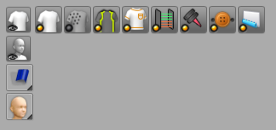
MD11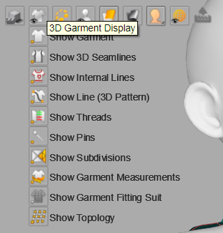
7 - Overall, the grey and yellow color theme of the interface is painful. The icons should *not* be monochrome - they should be reverted the previous colorful look (using colors to differenciate categories : orange for editing, gray for creation, red for inner shapes, blue for pleats ...), making each tool clearly differenciated.
MD5.5, extremely clear/sharp and readable :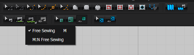
MD11, lacks contrast and is just unreadable at a glance :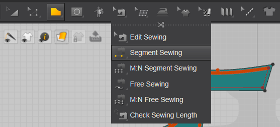
8 - Overall the MD11 interface is much, much slower than MD5.5, with menus taking sometimes seconds to show up. Something is just wrong with the menu system.
9 - Removing the shortcut for Transform Pattern doesn't remove the key from the tooltip. here I removed the A shortcut in the user preferences (for the current session at least ...), but it still shows in the tooltip. It's not a huge deal, but it is clearly broken :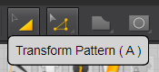
10 - When clicking an element in the 3D window, it gets selected on clickdown and then the gizmo shows up later on click release. Instead, the gizmo should show up instantly on clickdown. The current behavior makes the interaction feel sluggish/broken. Many other pieces of software have that same issue when selecting things (UE4 does that too), but when this is addressed (like in Blender for instance) everything feels so much better.
- - - - -
Lastly here are some more minor UX suggestions. These are less important than the ones listed above but I thought I'd share them anyways :
11 - I would love to have a way to fully disable or reduce the intensity of preselection highlighting in the 2d window - the flashing blue lines are very intrusive and distracting. I understand that some users love that, but for some it is very visually "triggering" for lack of a better work. The change of mouse cursor should be enough to know what is about the be clicked.
12 - The Select/Move tool (in the 3D view) should become a "move cross" only once a part is clicked on or actively being dragged on. The rest of the time it should be a precise triangle pointer. It should not be both all the time.
13 - When using the Transform Pattern tool, the mouse cursor should remain a precise selection arrow until something is actively selected or dragged. There can be a visual change indicating that a draggable pattern is being moused over, but it should not change to the directional cross until clicked, as this cross is less precise than the pointer.
14 - The little triangle indicating that a button (like Edit Pattern) will expand out showing more tools should be more visible.
10 - It should be possible to assign the same hotkey (say, Q) to one tool in the 3D view, and another tool in the 2D view, with the application selecting one or the other depending on mouse location. For instance the same hotkey for 2D seam stitching and 3D seam stitching.
- - - - -
Overall the current state of the program is IMHO somewhat worrisome. The feature set is fantastic but such regressions in UX really are an issue. For instance there really is no good reason for the use of such much worse icons and contrast. Perhaps the team is different ?
I hope these points make sense.
请先登录再写评论。